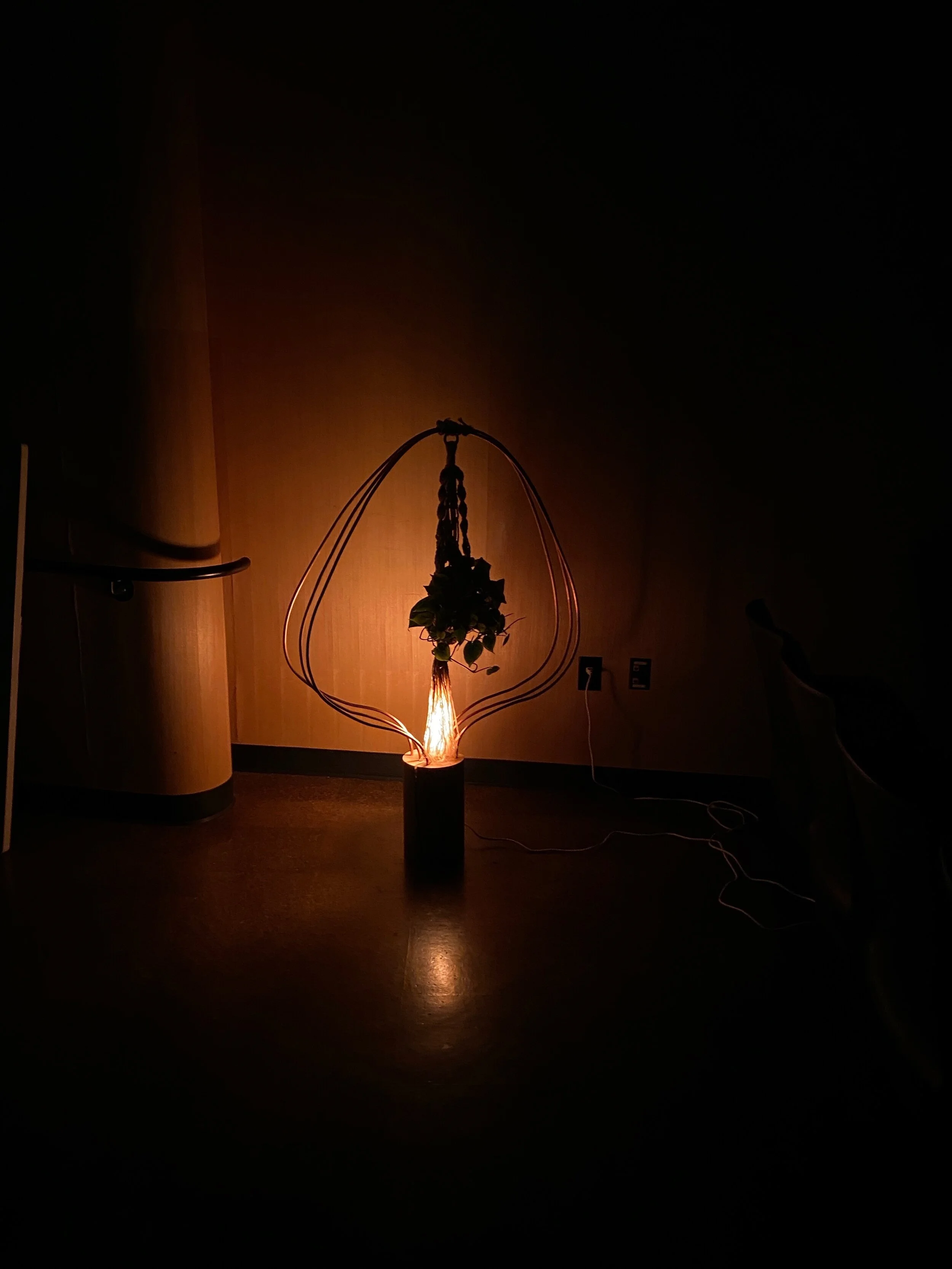
project description
project timeline: January 2020- March 2020
design a floor lamp that considers the needs of a chosen user group and their environment
understanding the lamp as a tool…
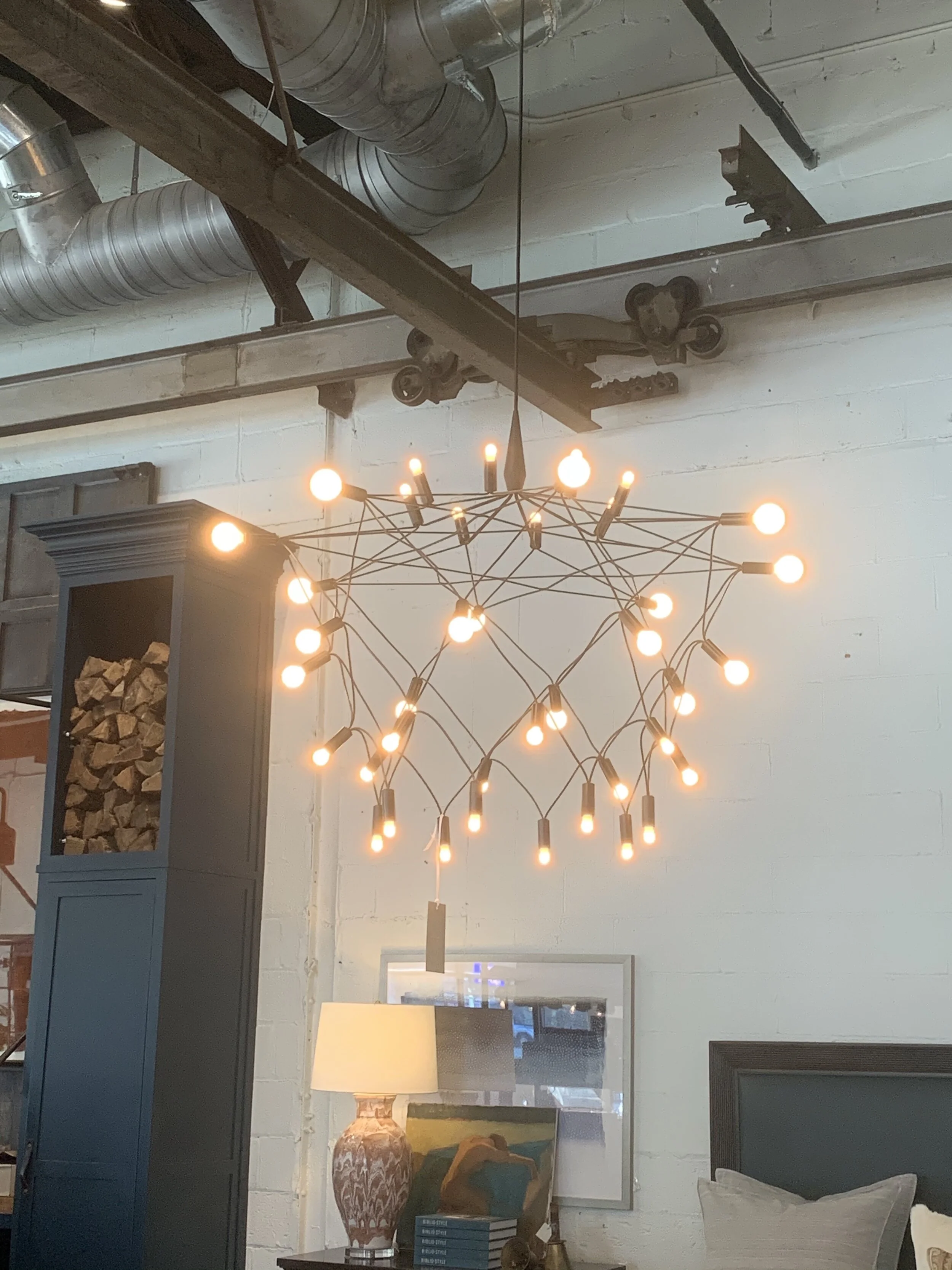
explore existing lamps
First thing I did was explore various furniture stores in West Atlanta to understand the existing trends in the lamp market. The insight I gained is that there obvious trends in the industry, the use of painted matte black on metal was a common theme. There was also a desire for sustainability, people wanted their lighting to last.
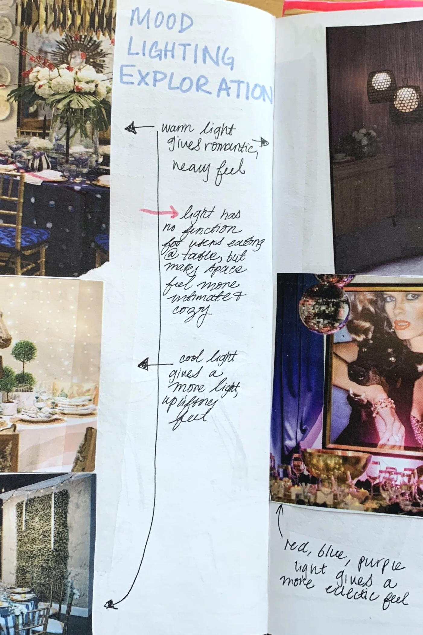
clip magazines
I found a bunch of used magazines and clipped the pages with interesting lighting. I wanted to understand how lighting could affect the ambiance of a space. The insight I gained is that the ambiance provided by the lamp was just as important as it’s form, and interesting lamps had a form that enriched the lighting experience
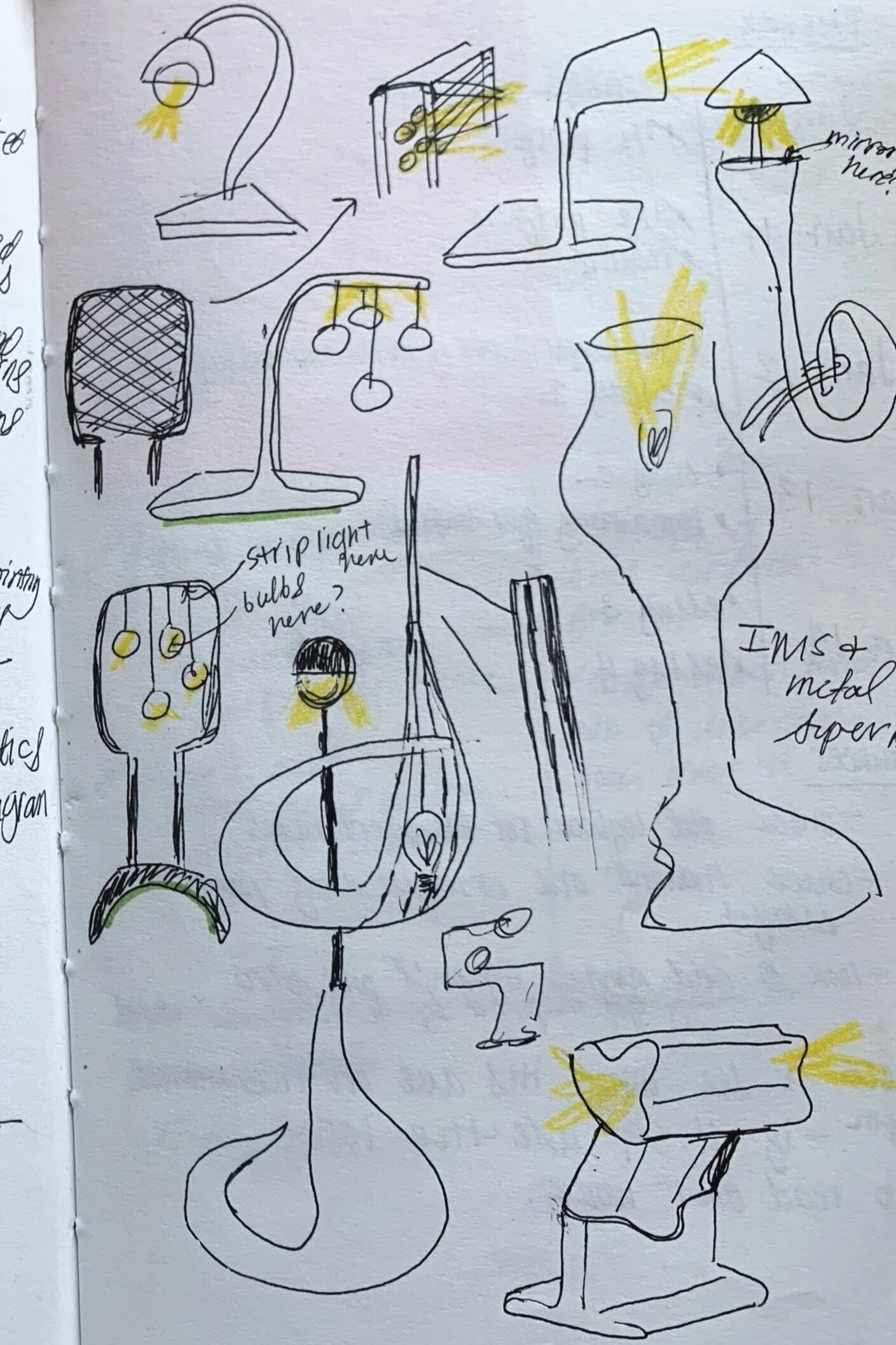
sketch thumbnails
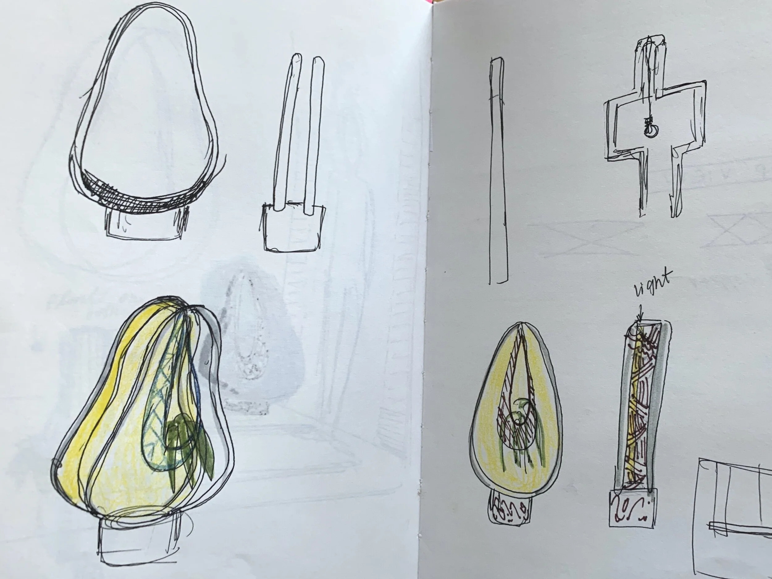
I took the knowledge that I learned from the field research and the magazines and started making small sketches. This allowed me to really understand the array of possibilities before I narrow down the design to serve a particular user.
choosing a user
Unlike the real world of design, I had the freedom to design a product for whatever company I wanted. I decided to choose a company for which I would design my lamp, based on these principles:
small business
supports wellness of people
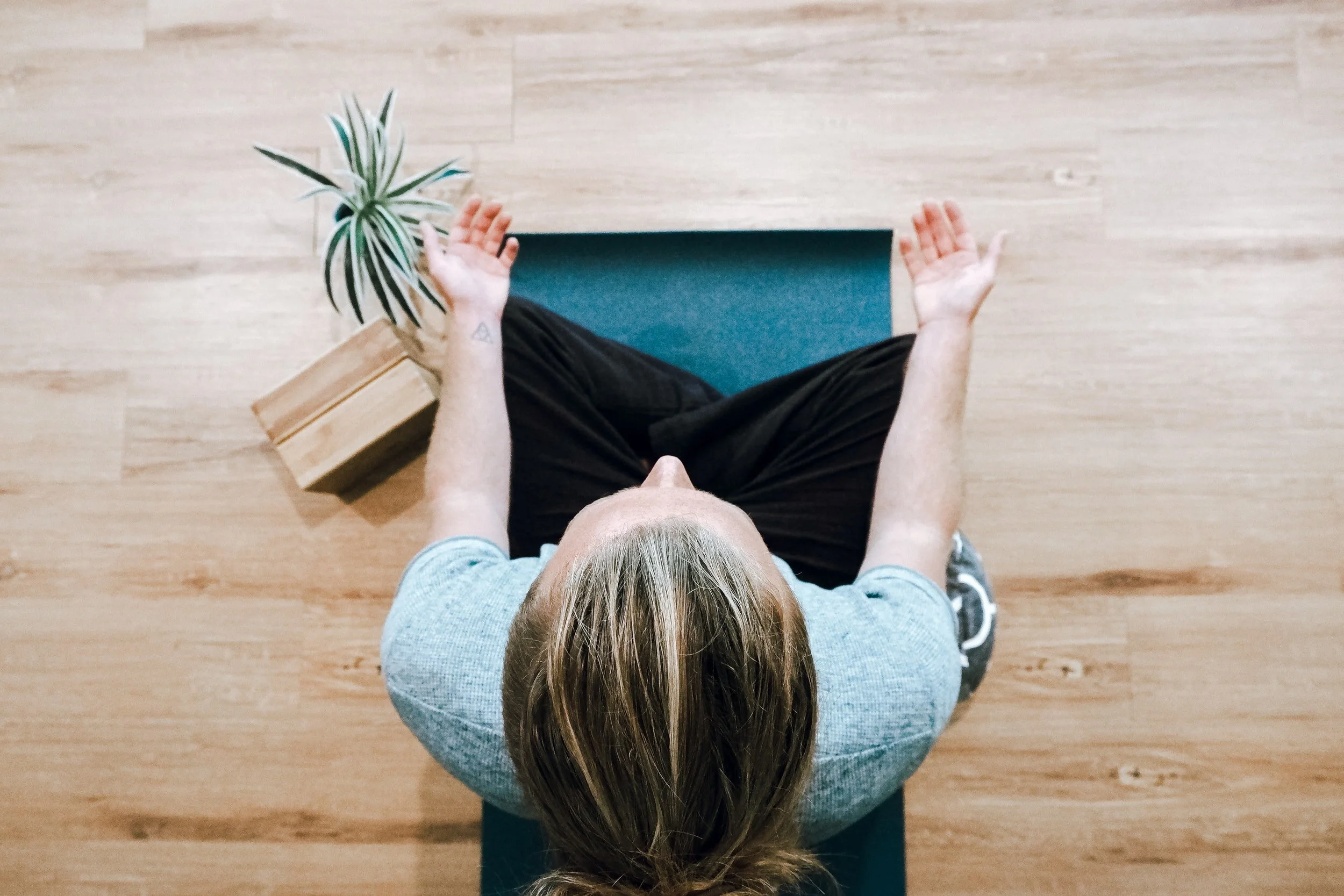
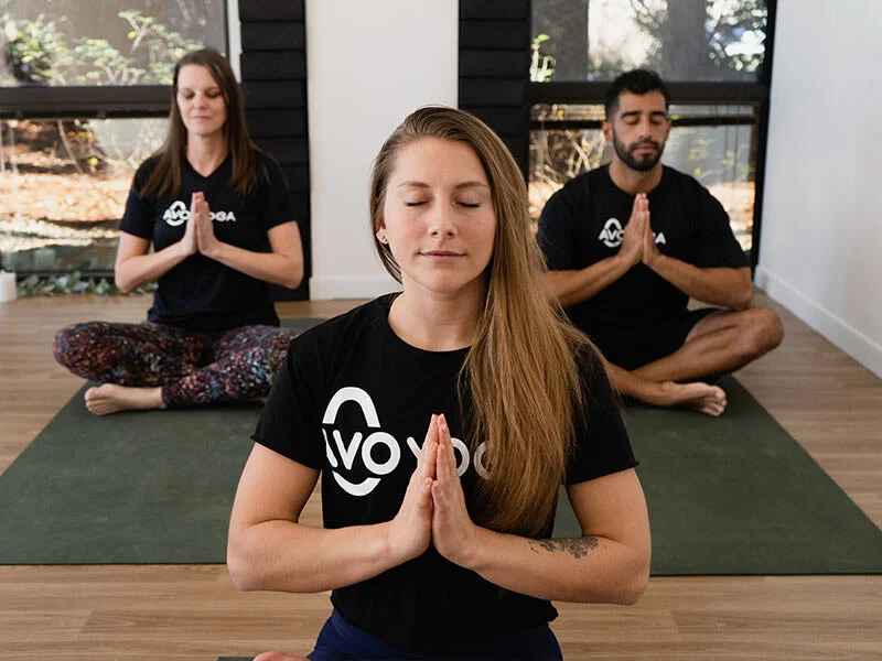
Based on these criteria, I decided to design my lamp for AVO. AVO is a yoga studio and chiropractic located in Atlanta Georgia, established in 2019.
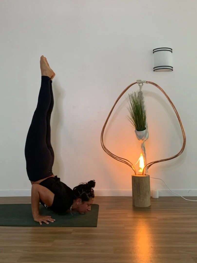
The mission of AVO Health is to “Ignite A Life Worth Living”, so the goal of my lamp was to reflect this mission in the design.
photo provided from unsplash.com
designing for AVO Health
considering the culture
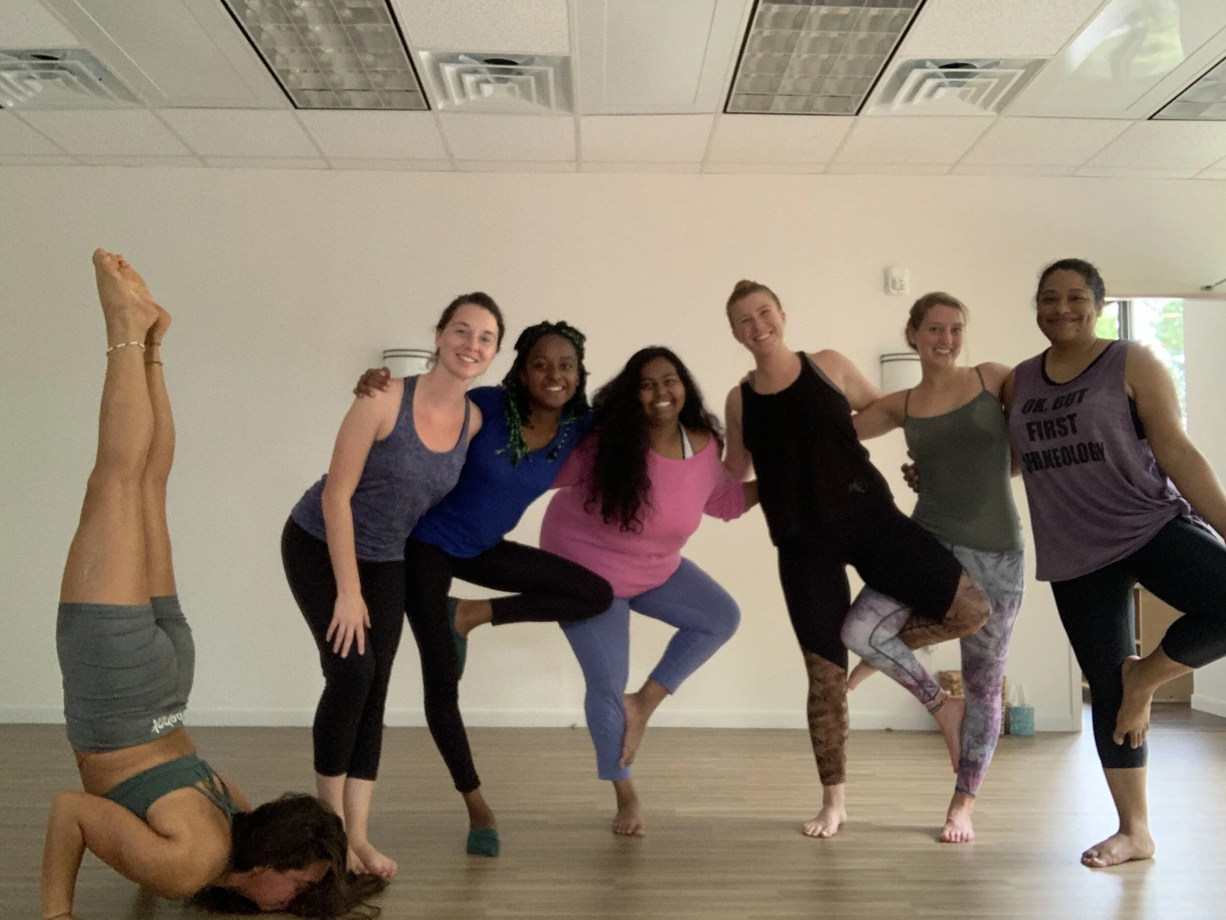
Before I started designing my lamp, I decided to take a couple classes at the studio so I could get hands on experience there. Here are the insights I made:
Yoga teachers are constantly considering the ambiance of the space
There is an emphasis on the use of natural materials
Yoga is a very experiential activity, utilizing all the senses
Yoga studios are very open spaces, often with minimal furniture
how could AVO Health use a lamp?
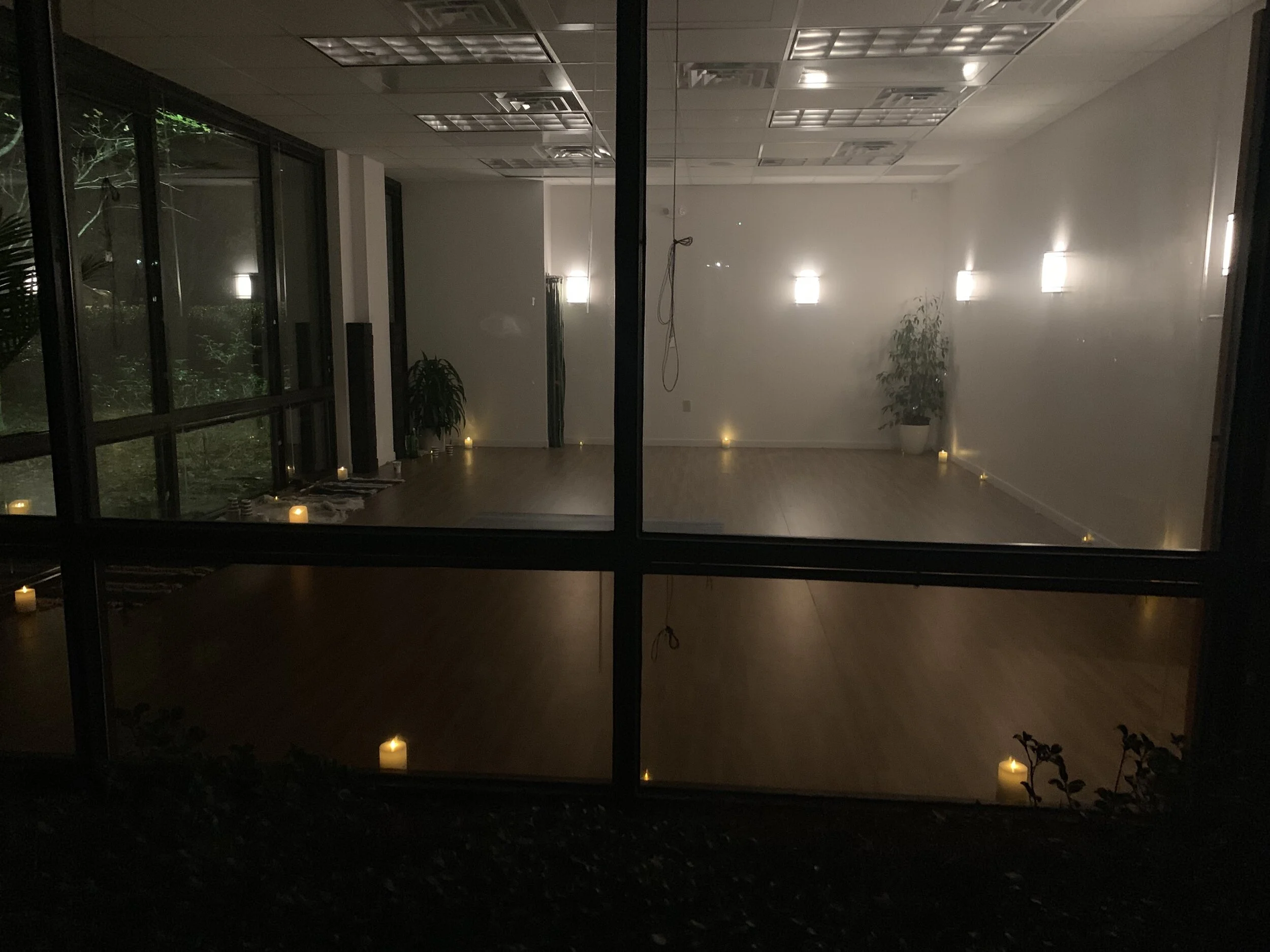
There are studio classes that run into the late evening, and because the walls are 50% windows, the room can get pretty dark after the sun goes down. The yoga teachers try to work around this by utilizing the ambient lighting of candles.
This led me to my problem statement: Design a better way than candle-lighting to bring more ambient light into the yoga studio, while creating a piece that tells the story of the AVO Health experience.
photo by Nia-Simone Eccleston
understanding the materials
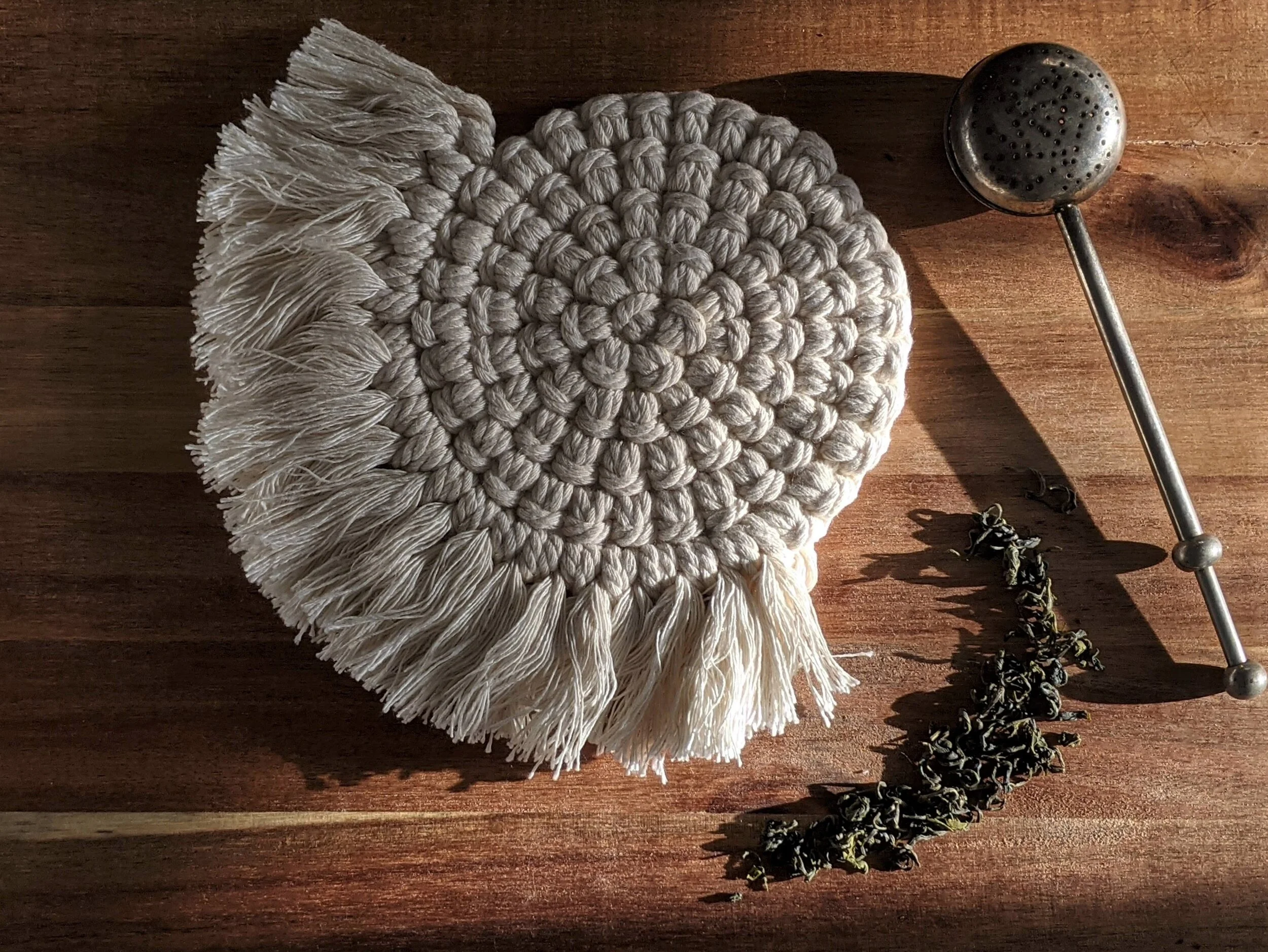
The emphasis of natural materials as a way to decorate the entire space is evident at AVO Health. I saw three reoccurring materials used in the space.
Wood and plant life
indoor plants, wood floors, sandalwood incense
Natural fibers
yoga blankets
I knew that my design had to utilize these materials in order to reflect the existing aesthetic language of the studio space.
photo by Suzanne Wilkinson from unsplash.com
acknowledging the logo
The graphic profile of an avocado, framing the name of the company, is an important part of brand’s language. It is the core of the company’s brand. The company wants AVO to have the healthful connotations typically associated with the fruit.
photo provided by avohealth.com
implementing the brand
I knew three things were important to AVO brand, and all three of those things had to be reflected in the lamp design.
Healthful lifestyle
Natural materials and aesthetic
Building community to promote well being
avocado as a motif
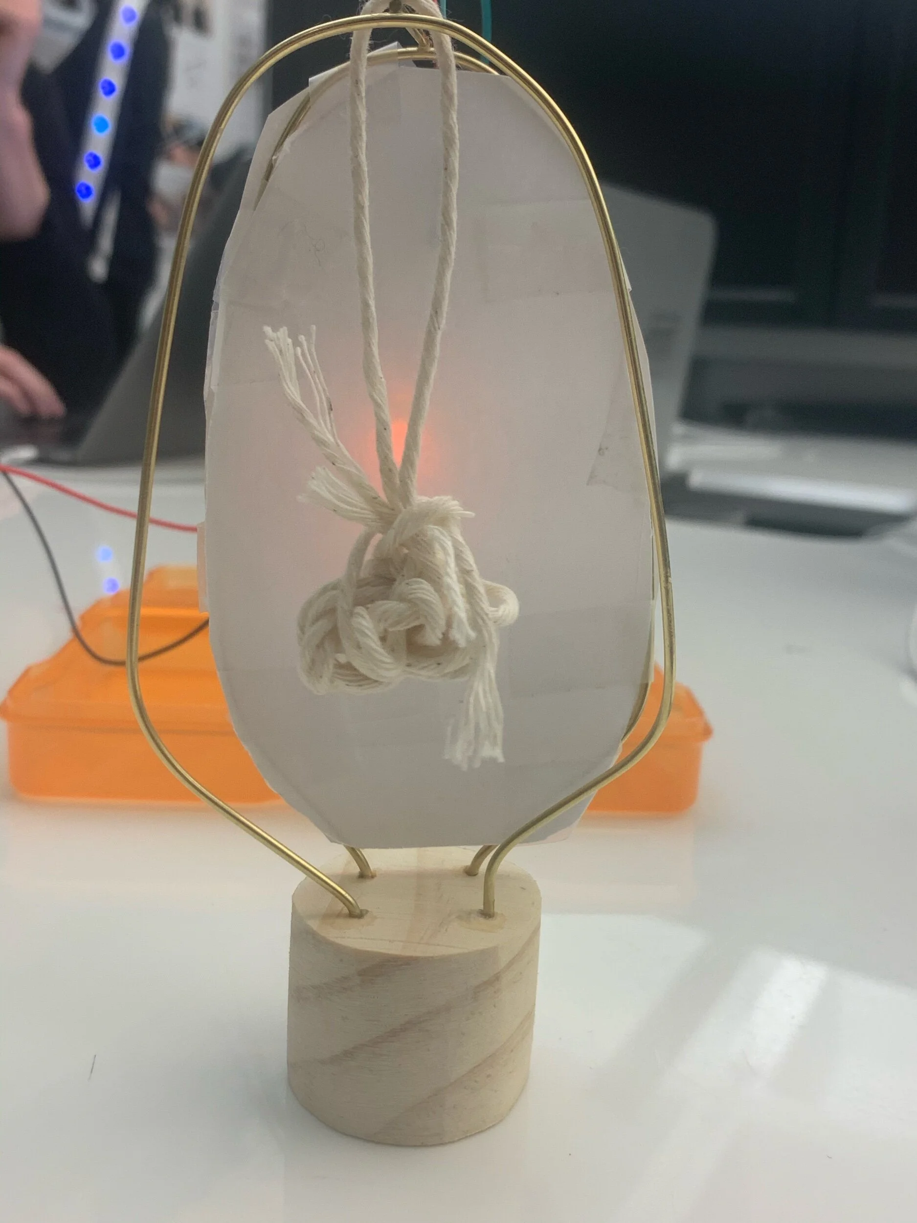
After doing initial sketches, I played around with a prototype compared of music wire, string, paper, and scrap wood. I knew how important the avocado profile was to the brand, and I wanted to carry that over to the lamp design in a subtle way, while also having an element in the center that would be a suggestion of an avocado pit.
bringing a concept to life
drawing
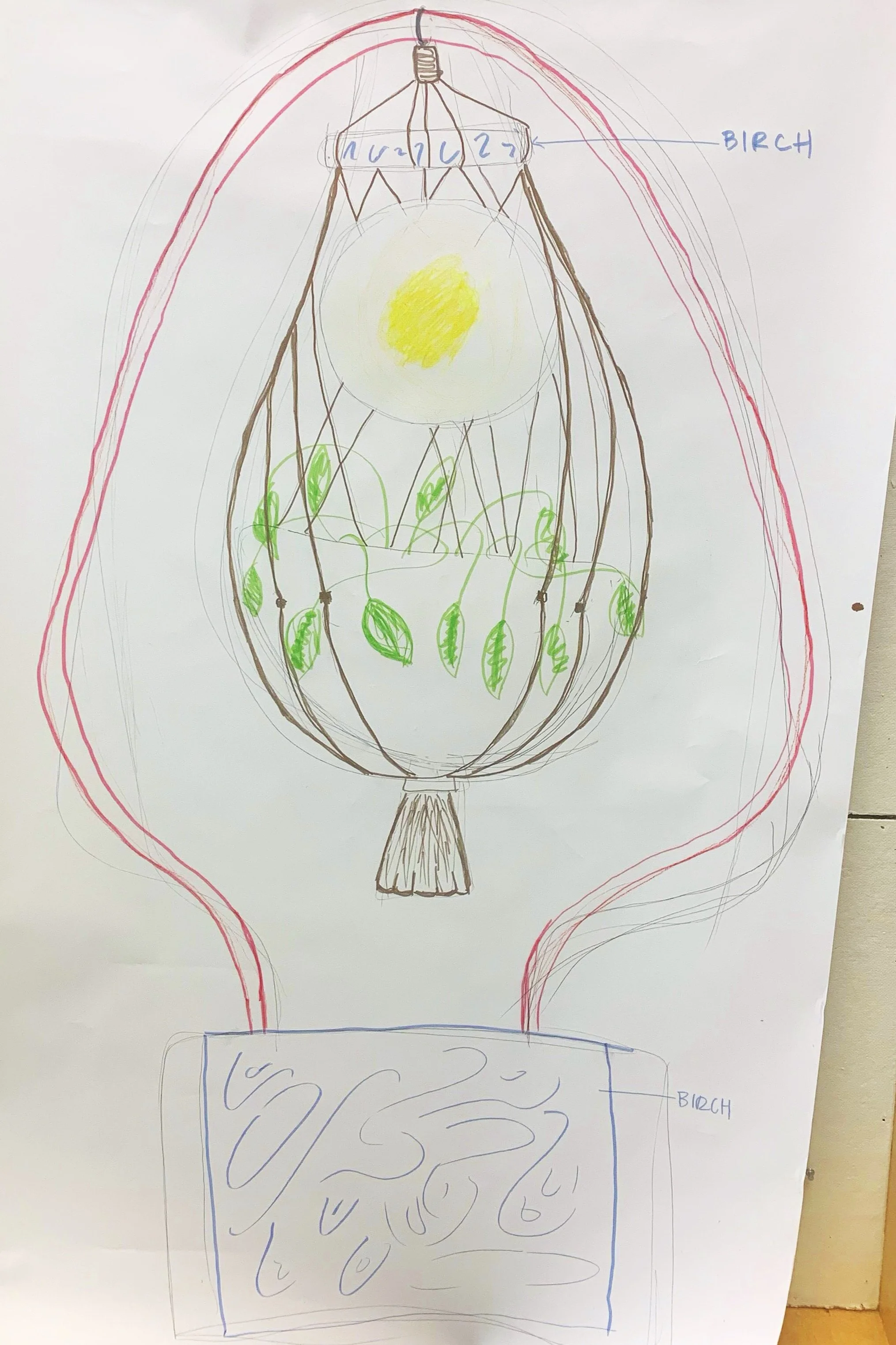
I took my small prototype and tried to realize in a larger drawing that was closer to scale. Looking back at my research I knew it was important to include: plant life, natural fibers, and wooden elements. I wanted the central element to be emphasized, stand out against the white space like the pit of an avocado.
building
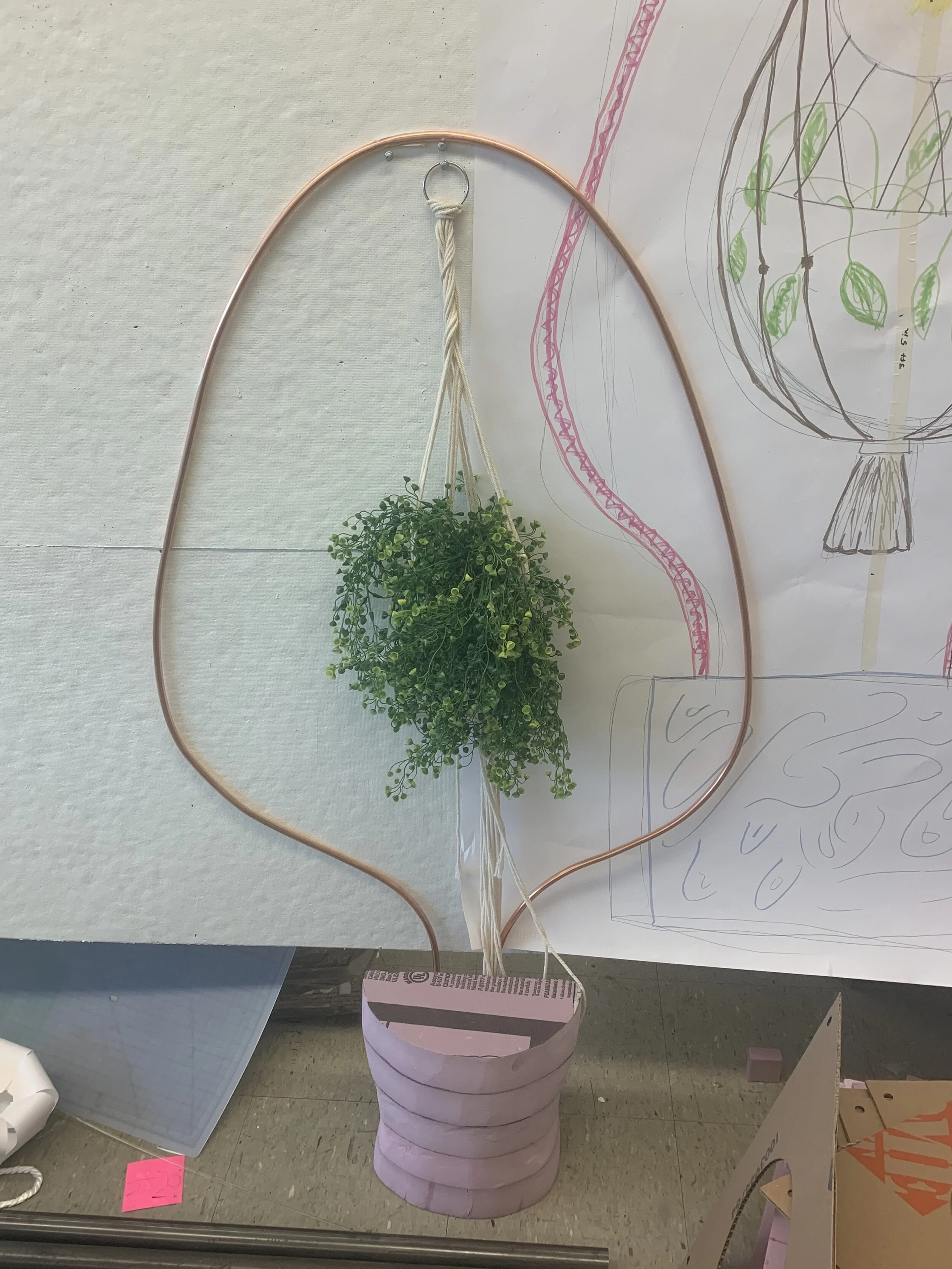
I took a piece of copper pipe and bent it into a desirable shape, and I started to mess around with the possibility of macrame as a basket to hold a plant that hangs from the lamp’s exposed skeleton. I had to figure out how the copper pipe would support itself and the load of the plant. I also had to determine where the lamp lighting would be located.
validating
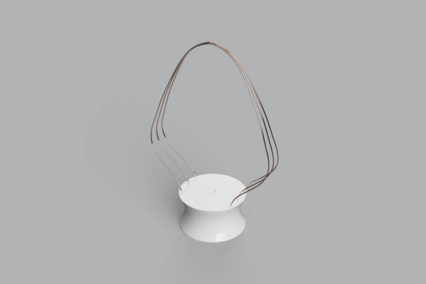
I took my concept into CAD Fusion 360, using the rough dimensions from my prototype. I realized having more than one copper pipe would better support the weight of a plant, while also adding visual interest to the design..
modeling the form
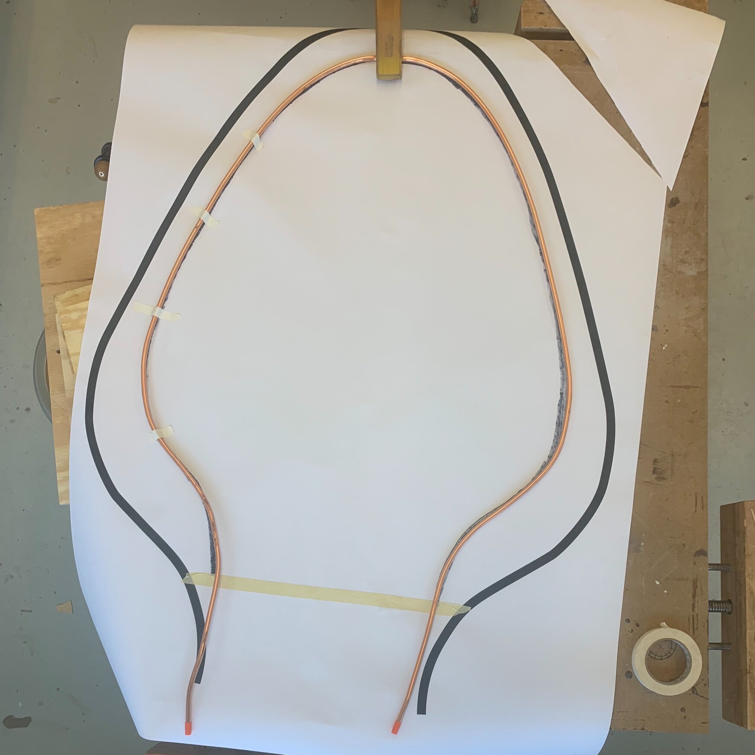
I had to make 3 avocado sculptures out of the pipe, and they all had to be virtually identical in order to match the outcomes of the CAD. I drew a sketch on poster paper and clamped down each pipe at a central focal point, bending it to match the curves of my sketch.
running some initial tests
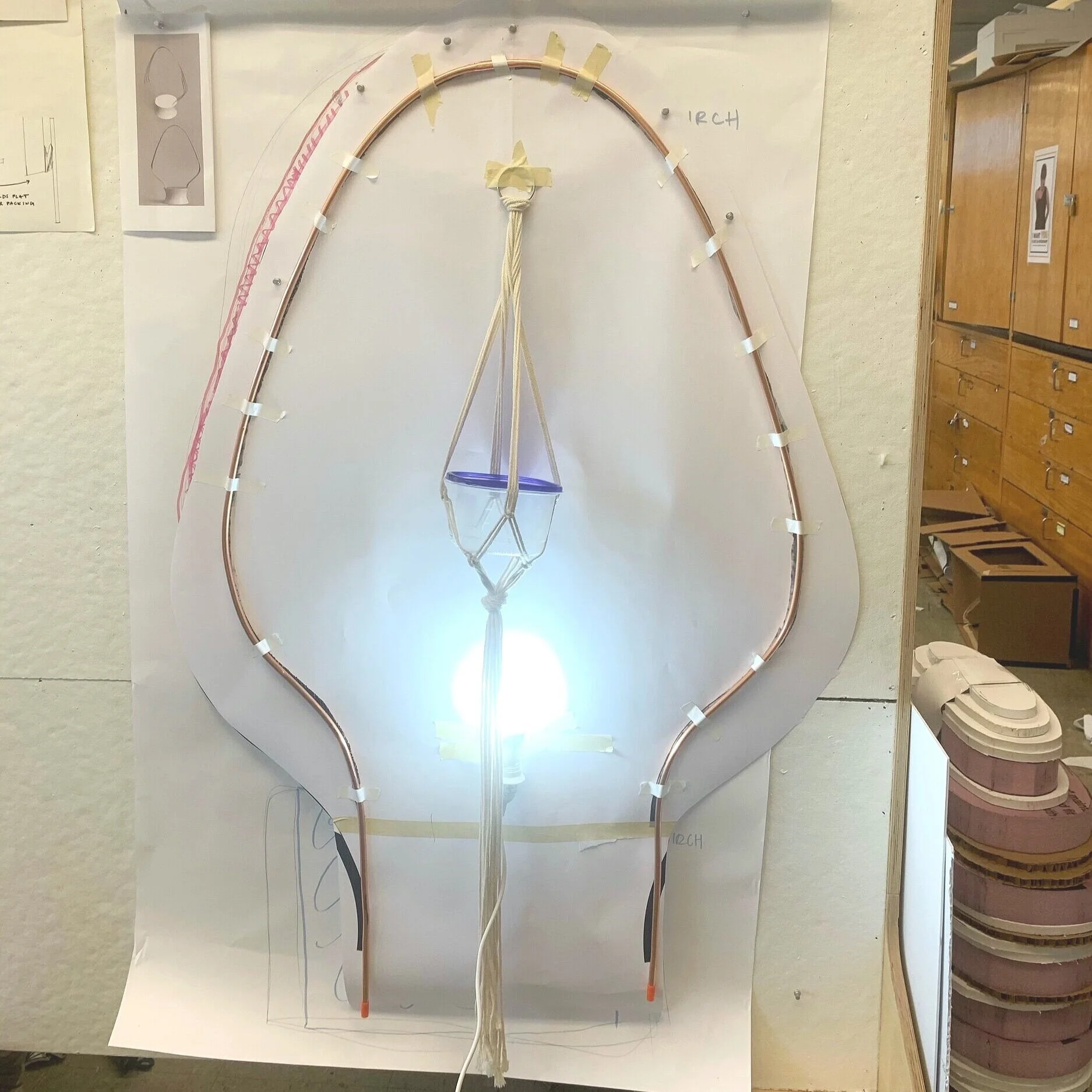
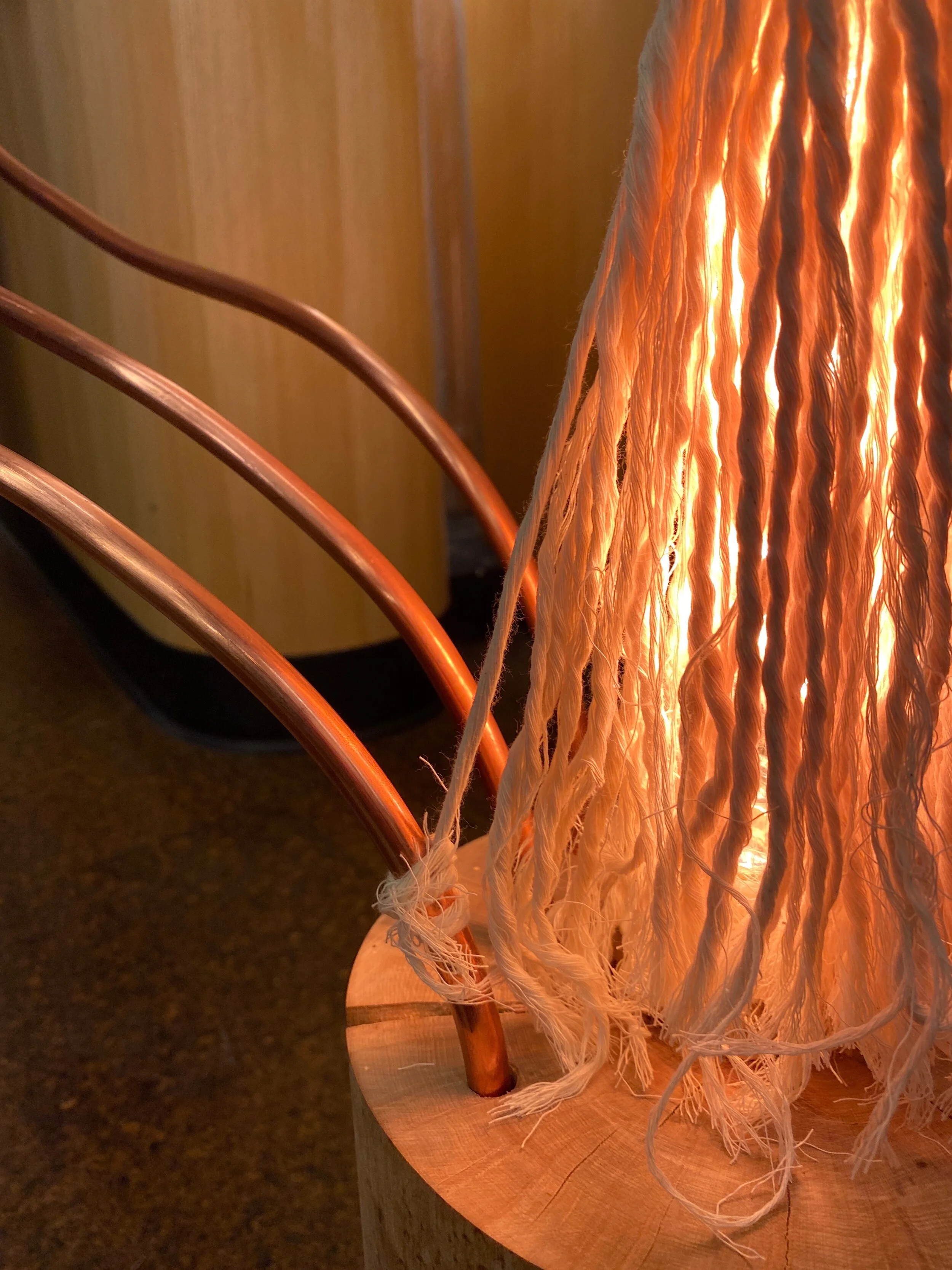
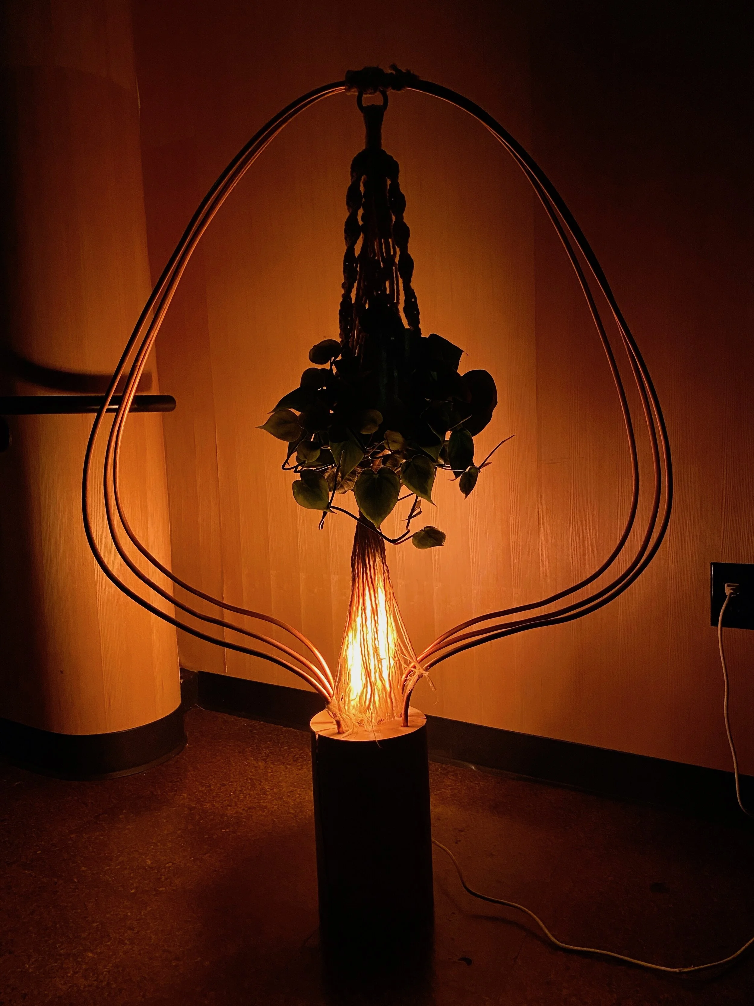
I took the copper piece and did a rough prototype on the wall to get a sense of scale (the lamp measures about 3.4ft tall). I also had to determine where the lighting would be placed. I decided it could be set into the base of the lamp, and be muted by the fibers of the macrame that would cover it from above, creating a muted glow.
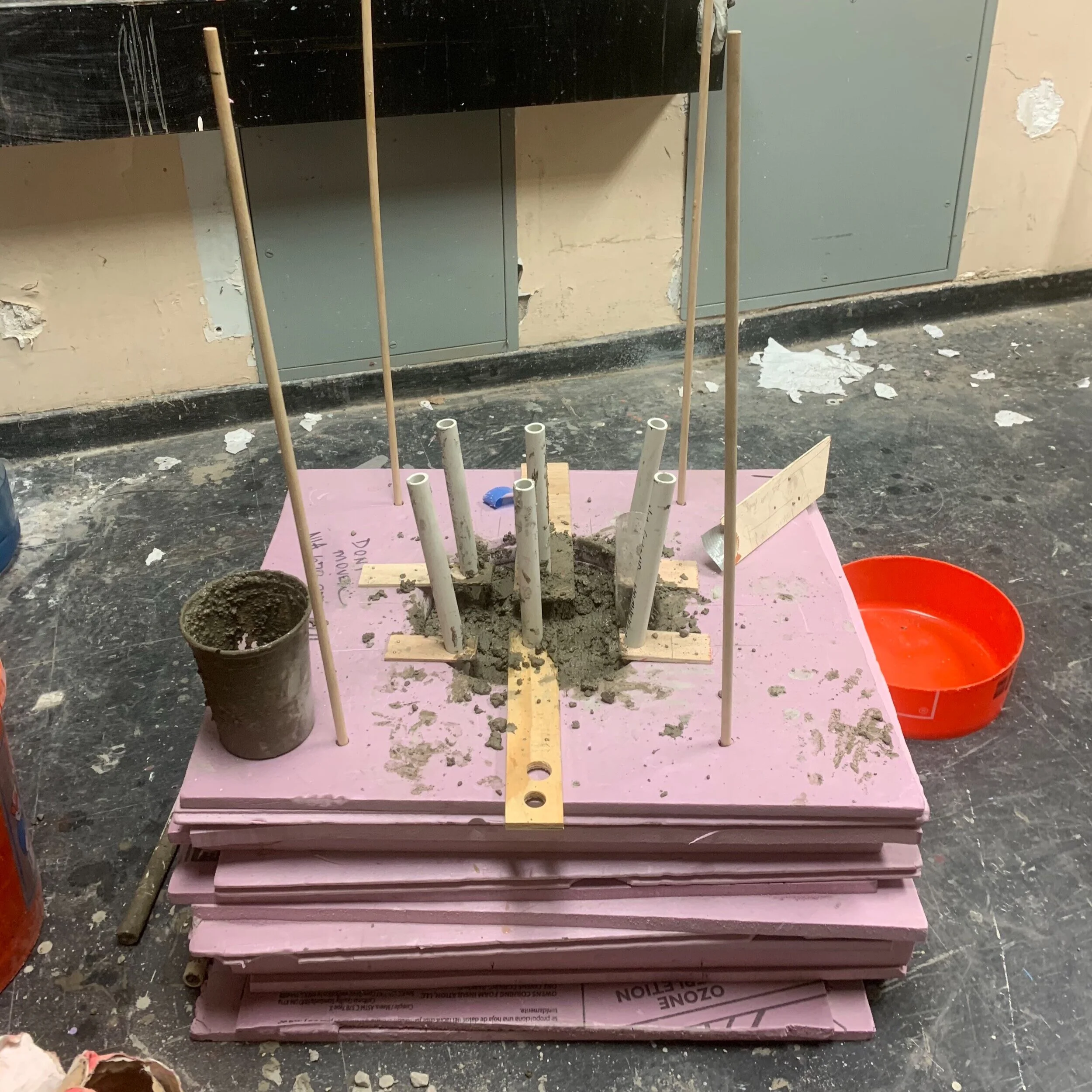
making mistakes along the way
I drifted from my research and got fascinated by the idea of a concrete base. Here I have poured the concrete into the mold. The inserted pipe acted as place holders where I would insert the legs of the avocado frames.
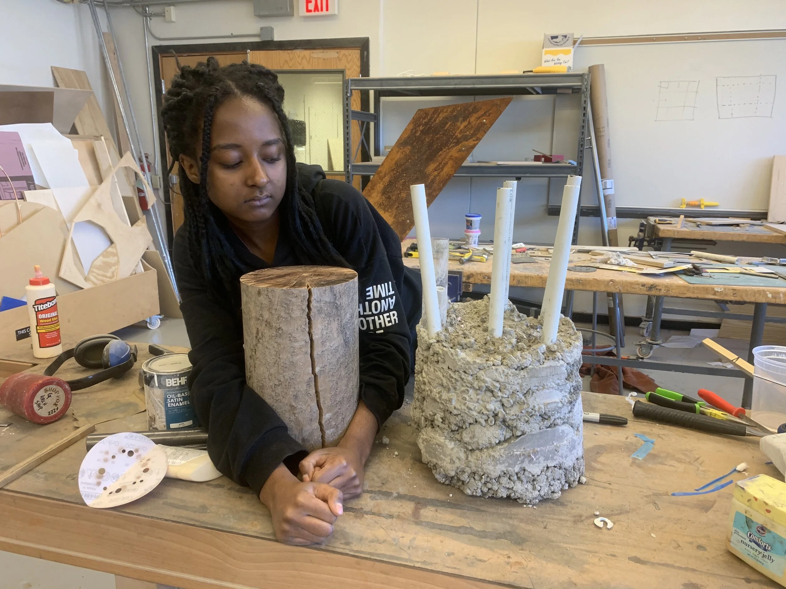
getting back on track
Making a concrete base really solidified my initial design, making me realize that using a light wood, Birdseye maple, like I initially intended, was aesthetically a sound choice, validated by research.
Through this experience I realized that as a designer it is important to be confident in the decisions you make when they are backed by research, and avoid acting impulsively.
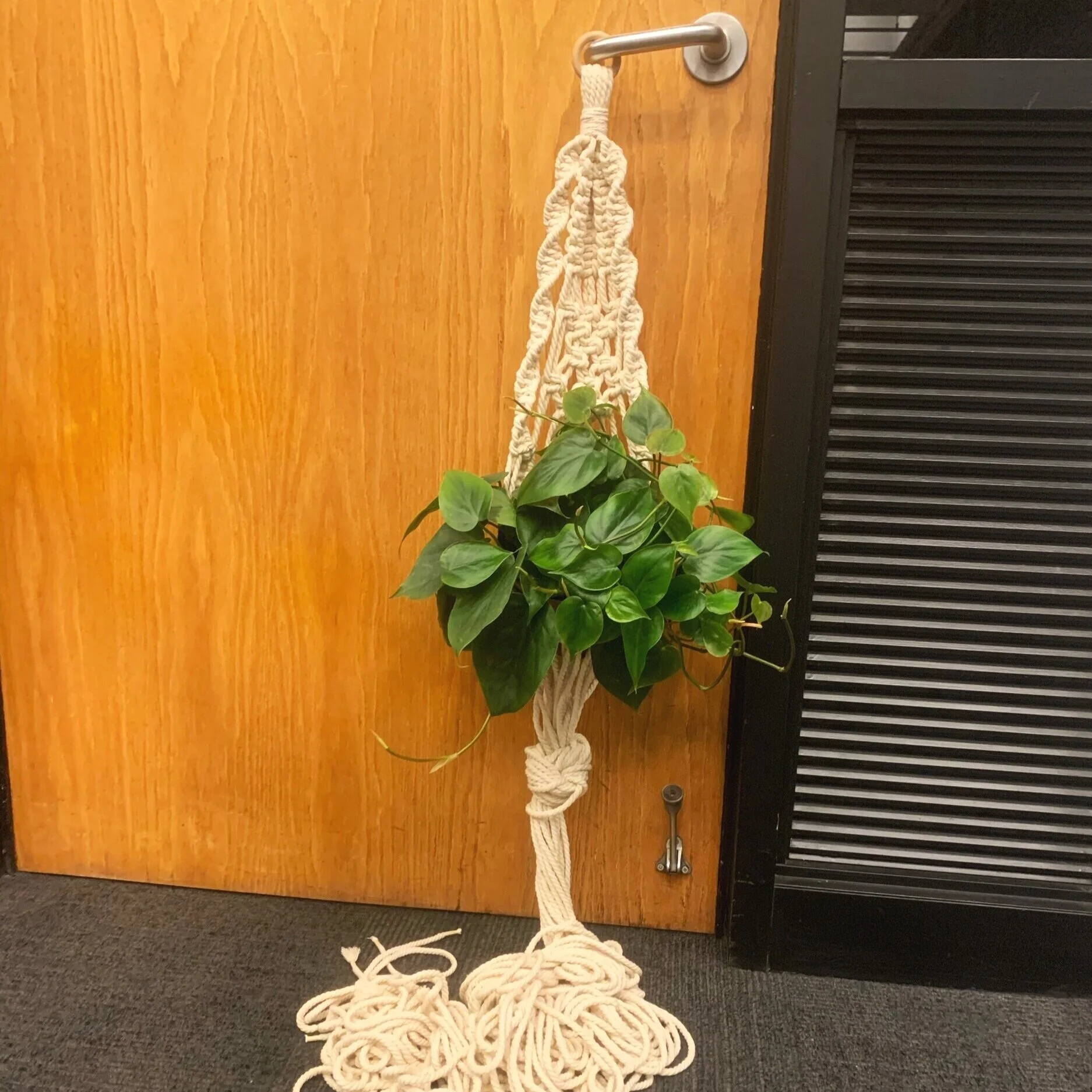
macra-making it happen
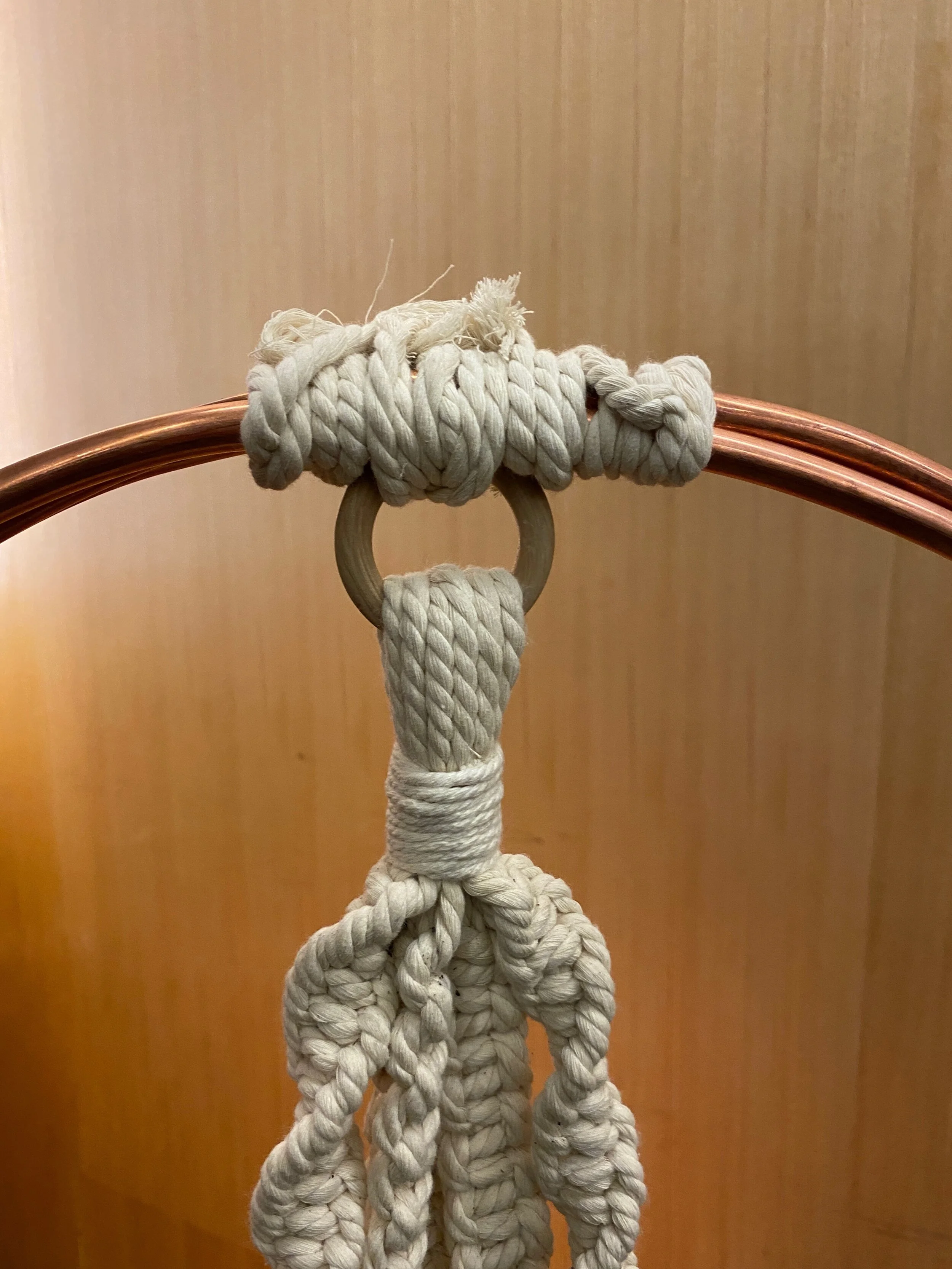
The final step was to find a macrame design that would accentuate the design of the lamp and speak to the brand identity of AVO. I decided to implement this double helix for two reasons. It reflects the bending and curving of spine, which is such a pivotal part of the yoga practice and the chiropractic experience at AVO Health.
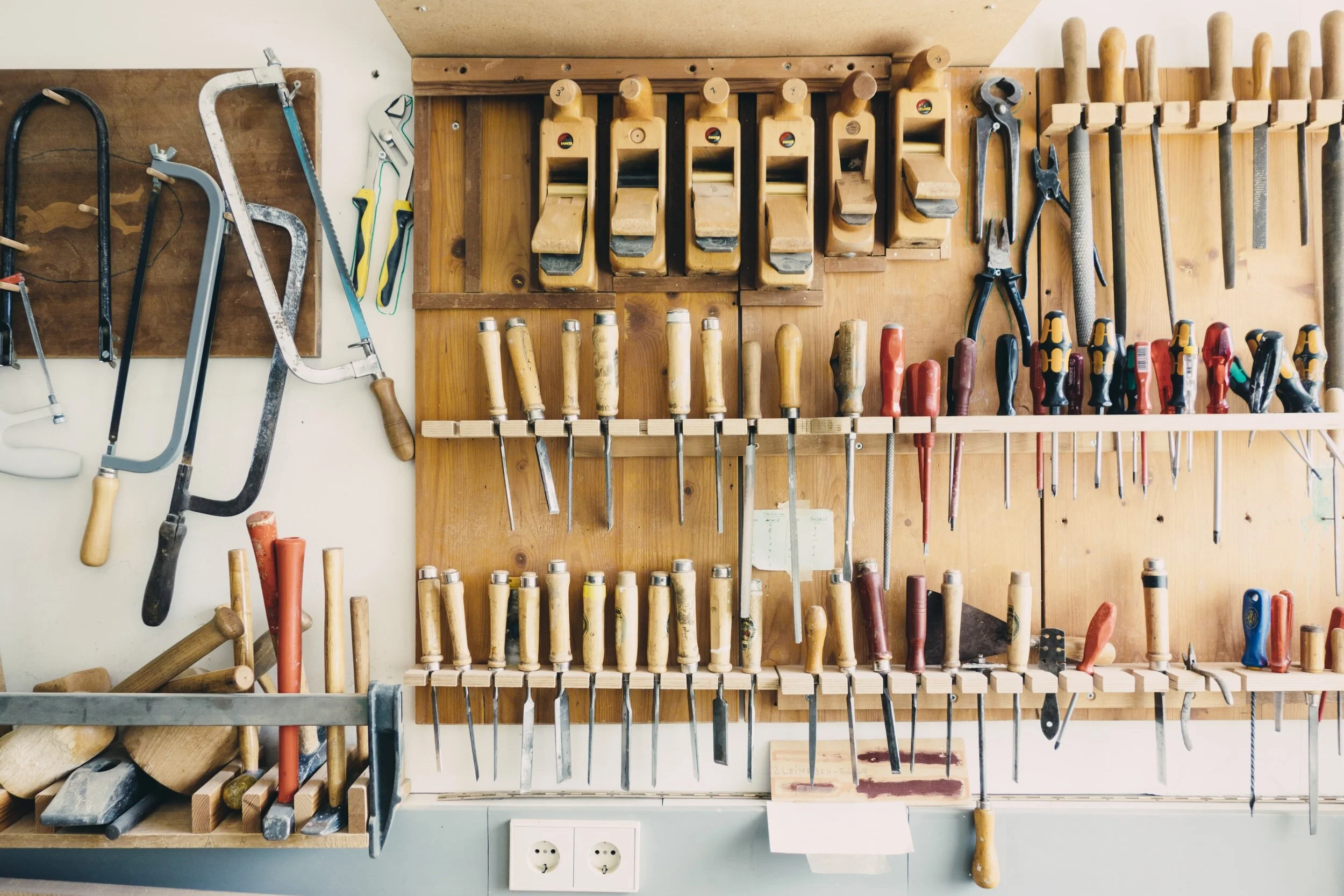
making the final lamp
drilling holes in birch,
inserting copper pipe into holes,
securing macrame basket onto pipe
routing wires ,
screwing lightbulb into socket
final remarks
The goal of my lamp was to help AVO communicate its mission: “Ignite a Life Worth Living”. My use of warm lighting, hidden under the natural twine hinted at the idea of igniting, or the start of a fire. Likewise, the use of the avocado motif coupled with real plant life is a testament to AVO’s brand identity, living a natural lifestyle, which would ultimately lead their customers to a better quality life.